At the very core of it, marketing is about attracting and retaining customers. And one of the best ways to do that, as we know, is to stand out from the crowd.
That Small Detail that Changes Everything…
As business owners, we also know that there’s such a thing as being “too” unique. You want your niche’s audience to appreciate and accept your business, after all. That means creating a brand that attracts and a website that sells.
You’ve got loads of components to your website: sales pages, blogs, photos, videos, and landing pages (more info here). You’re constantly checking links to make sure they work, and doing regular administrative clean up to make sure your stock and prices are accurately reflected.
But have you ever stopped to think about fonts? Yes, fonts. The shapes of the letters used on your site. We’ve talked about User Experience and User Interface before (UX and UI, respectively), and how you need to be sure your audience can read your site. Let’s take a deep dive into the topic of fonts, specifically, how using just the right font on your landing pages can make a huge difference in conversions.
Why Should I Be So Concerned About My Landing Pages?
As the name implies, landing pages are where people perusing the internet may “land” when following a link to your site. Whether they’re casually interested in your site following a compelling blog post that they read elsewhere, or they’re actively shopping for the product or services you offer, they chose to follow that link, and first impressions really are everything.
Take a moment to think of someone you really admire: a celebrity, a mentor, anyone, really! Imagine you hear a knock on your door, and that person is standing on the other side. Only, your entryway is an absolute wreck. There are cat hairballs on the rug, the floor hasn’t been swept in months, and the paint is starting to peel.
How would you feel in this particular scenario?
That feeling is also what you might feel when a potential customer reaches your landing page and finds it in disarray. You’ve got a black script font on a red background,like this, and you kind of have to tilt the screen to really figure out what it says… maybe if you copy and paste it into a Word doc? Yikes. A customer who encounters a mess like that is going to leave in a frustrated hurry.
On the other hand, imagine your hero arrives at your house, and your doorknob is perfectly polished, the rug swept, the gentle scent of lavender caresses the air, and you have a delightfully chilled beverage on hand to offer them.
This is how customers feel when they encounter a perfectly manicured landing page. They see things that are simple and compelling, and they want to know more. They read, they click, and they might just even give you their email address.
Read also: 5 Lead Magnet ideas to Increase your Conversion Rate
Fonts Have Feelings, Too
Therefore, it’s very important to pick fonts that are clear and stand out appropriately from your background. But did you know that fonts also have personality?
It turns out, the human brain gives fonts different characteristics. Here’s a fun party trick:
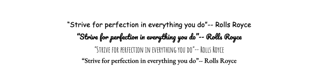
It makes a difference, doesn’t it?
From the extremely casual Comic Sans to the indecipherable mess created by bold script fonts, seeing the very formal guiding principle of elite car manufacturer Rolls Royce in various fonts can give you a different impression. Which one makes you think of the Rolls Royce brand, as you know?
Additionally, size and spacing makes a big difference in the text you place on your landing page. Some fonts lend themselves very well to being big and bolded, while others will get oddly pixellated and become illegible.
Some spaces will have tight “kerning”, or spacing between the letters, while others are designed to evenly take up the same amount of space with each letter. Big fonts convey important information, while small fonts are used to convey less important, but still significant, details.
The Best Fonts for Your Landing Pages
So what are the best fonts for your landing pages?
Most experts note that for mobile-friendly pages, you’ll want to stick with a maximum of a 16 point font. You can use different font sizes within your landing page, but the fewer size changes, the better: no more than 4.
When it comes to choosing the right color, contrast is always eye-catching, but make sure it’s legible and pleasing to the eye. Red and green may be complementary colors, according to the principles of design, but when these colors are applied at top saturation to a web page, it’s an assault on the eyes. Stick to using fonts and colors that are bold, but also legible and clear.
Read also: How Colors affect your Customers Purchase Decisions
To ensure that all customers have the same experience looking at your landing page, choose web-safe fonts. These will look the same regardless of the browser being used to view the page, and include:
- Verdana
- Geneva
- Courier New
- Arial
- Helvetica
- Tahoma
- Lucida Console
- MS Serif
Your knee-jerk reaction might be that these are pretty common and bland fonts. But remember: you can make adjustments in your web editing software. Italics, bolding, colors, adjusting spacing, and even the size of the font will convey different meanings.
CHECK OUT THE LANDING PAGES TOOL
THAT INCREASED BY 114% MY LEADS CONVERSION RATE
CLICK THE BUTTON BELOW TO GET:
| 200+ Pre-Built Converting Templates | SEO Friendly Pages |
| Easy to Use Page Builder | No High-Tech Skills Needed |
| A/B Testing | Integrations (Autoresponders ,CRM) |
| No Limits (Leads, Publishings…) | Free up to 500 email subscribers |
| 99,9% Uptime | GDPR Compliant |
| Popups & Alert Bars | 14-Days Free Trial |
One More Small Advice
While selecting the best font for your business’s landing page may require a little tweaking and testing, there is one very important detail to always keep in mind: Write down the font you’ve chosen in your style guide. It may seem inconsequential now, but once your business is fully booming and you’ve got ads everywhere, it will be very important to keep your branding consistent.
You can absolutely change your fonts at any time, but when you do so, you want to do so across the board to avoid any confusion. Imagine if you followed a typically-branded Rolls Royce link to a page that was written in all Comic Sans!
Owning a business means standing out from the crowd, but when it comes to conveying information, you want to make sure your uniqueness takes a slight backseat to usability. Choose a font that represents your brand, but doesn’t muddle the message you want your prospective customers to receive.